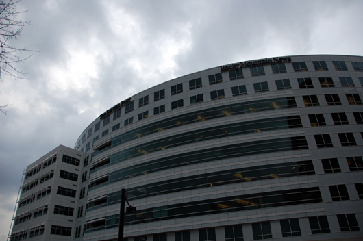
On the final day of the American Copy Editors Society conference in Denver, a few nice guys from the Rocky Mountain News and The Denver Post took a large group of editors on a tour of their not-so-humble abodes. Through a joint operating agreement that formed the Denver Newspaper Agency, the two papers share a $100 million, 318,400-square-foot building they moved into in August 2006. (For more about the building, go here.) Interestingly, neither of our guides had seen the opposition newspaper's side of the building (or so they said). Their business ends may cooperate, but they are not allowed in each other's space. Their editorial independence is obvious, too: They guard and pride their own journalism.
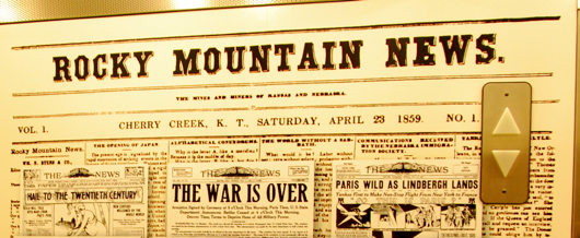
Even the elevators display the papers' journalism history. Behind the elevator directional arrow is a collage of historic front pages from the Rocky.

Even the elevators display the papers' journalism history. Behind the elevator directional arrow is a collage of historic front pages from the Rocky.
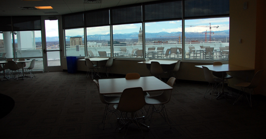
The first stop on our tour of the Rocky was in the break room. The Rocky doesn't print a paper on Sunday, so it was empty on this Saturday. But imagine having a view of the Rocky Mountains, including Pikes Peak, while you're chomping on your bologna sandwich or dry leftover spaghetti. I wouldn't mind. (The view, that is. I could do without my own "cooking.")
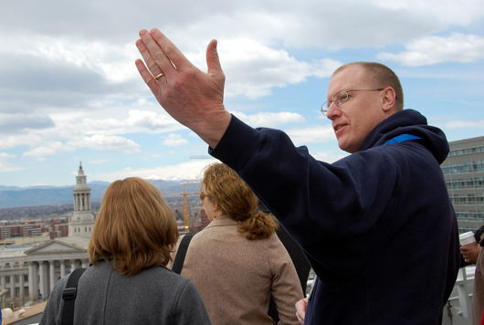
John Boogert, Internet news editor at the Rocky, was our tour guide for his part. He participated in the same panel about online editing that I did. He was determined to show us how much better the Rocky's side of the building is. Each paper designed its space independently of the other. Above, Boogert points out the view from the rooftop of Pikes Peak and the assorted government buildings.
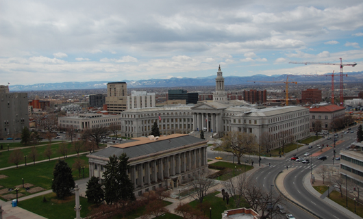
The Denver newspapers are right in the thick of the capital. Above are some more government buildings with the mountains in the background.
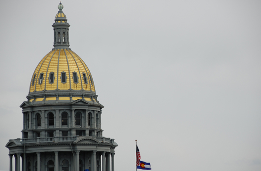
Here's the gold dome of the Capitol.
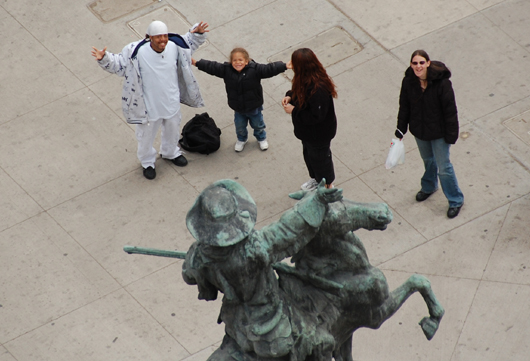
I was leaning over the side of the building to take a photo of the mounted statue below when the people walking by it thought I was trying to shoot them. They stopped and posed, so I had to take the photo.
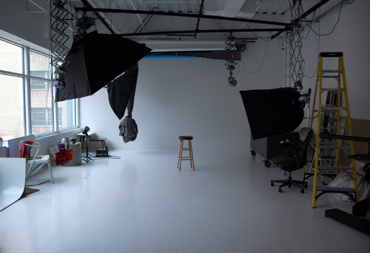
The lone stool in the middle of the Rocky's photog studio has a simple beauty.
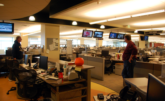
This is the view of the Rocky newsroom from the online department. They have nice TVs. But they aren't as nice as my roommate's.
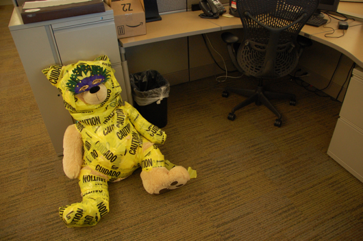

Apparently, every good newspaper must have a Mardi Gras bear. The caution tape probably is hiding all the beer stains.
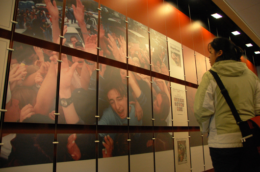
The Rocky displays its Pulitzer Prizes proudly. The above composition is of the Columbine shootings.
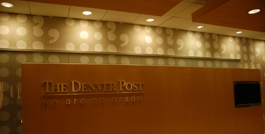
The walls in the newsroom lobby at The Post are covered with punctuation marks. But I don't see an interrobang on this wall?!
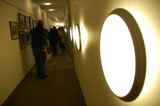
Each newspaper did some interesting things with lighting. Above, wall lights line the passageway to the Post newsroom.

Each newspaper did some interesting things with lighting. Above, wall lights line the passageway to the Post newsroom.
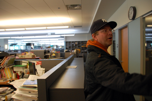
Marc Chamberland, head of business copy editing at The Post, was our guide for his part of the building. Above, he stands next to the copy desk.
My bias shows in the number of photos I posted of each newspaper. The score is: Rocky, 10; Post, 3. The Rocky definitely had the polished, sleek, cool newsroom. Sorry, Post.
Smokin' ACES home
Smokin' ACES home


No comments:
Post a Comment